How a spectrophotometer reads a fabric, what L*, a*, b*, C* and h mean for shade correction, how ΔE CMC and CIEDE2000 set pass limits, and how to avoid metamerism, with a worked report example.
At a glance
d/8, SCIUsual textile measuring set-up
D65/10°Common primary illuminant and observer
≈1.0 CMC 2:1Typical pass limit (varies by buyer)
(1 − R)² ÷ 2RKubelka-Munk K/S
Every dyed lot ends with one question: does it match the standard? For years that question was answered only by eye, in a light box, by the most experienced person on the shift. Today most dye houses also answer it with a spectrophotometer and a printed report full of numbers: ΔL, Δa, Δb, ΔC, ΔH, ΔE CMC. Buyers set their pass limits in those numbers, and many disputes between a mill and a buyer are settled by them.
This article explains what those numbers mean and how to use them on the floor and in the lab. It starts with how we see colour, then covers reflectance curves, how a spectrophotometer reads a fabric, the light sources we test under, the CIELab colour space, the different ΔE formulas, metamerism, visual assessment, strength and shade sorting, and the Kubelka-Munk idea behind recipe prediction. It finishes with the common mistakes and a worked example of reading a report and deciding the correction.
How we see colour: light, object and observer
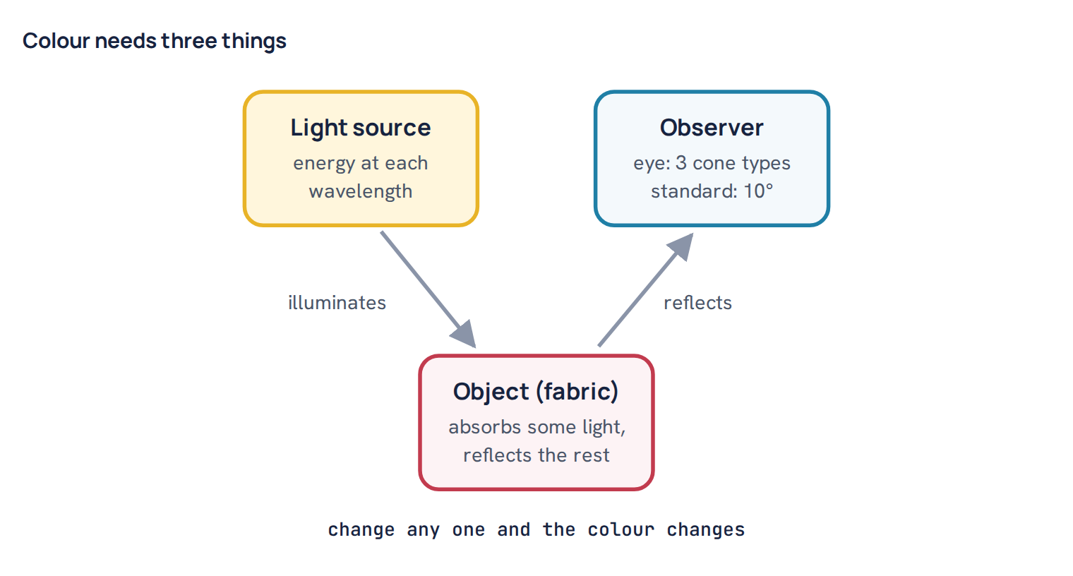
Colour is not a fixed property of the fabric alone. It is what happens when three things meet: a light source, an object and an observer. Change any one of them and the colour you see changes.
- The light source sends out energy at every wavelength of the visible spectrum, roughly 400 to 700 nm. Daylight, a shop’s fluorescent tube and a warm tungsten lamp each send out a different mix of wavelengths.
- The object absorbs some of that light and reflects the rest. Dye molecules in the fibre absorb certain wavelengths strongly. A red fabric absorbs much of the blue and green light and reflects mostly red.
- The observer is the eye and brain, or an instrument that imitates them. The eye has three kinds of cone cells, sensitive roughly to short, middle and long wavelengths. The brain turns their three signals into the sensation we call colour.
An instrument cannot “see” colour the way we do. What it can do is measure the object part precisely, then combine it with standard tables for the light source and for an average observer. That is exactly what colour measurement software does.
Reflectance curves: the fingerprint of a shade
A spectrophotometer measures how much light the fabric reflects at each wavelength, usually every 10 nm from 400 to 700 nm. The result is a reflectance curve, with wavelength on the bottom axis and percent reflectance on the side axis. A white fabric reflects highly across the whole range. A black reflects very little everywhere. A red has a low curve in the blue and green region and rises steeply in the red region.
The curve is the most complete description of a shade. Two samples with identical curves will match under every light source and to every observer. Two samples with different curves can still look the same under one light, but not under all of them. That is the root of metamerism, which we come back to later. When you have time, look at the curves on the screen and not only at the numbers. A curve shows you which part of the spectrum is out, and that often points straight at which dye in the recipe is responsible.
The spectrophotometer: how it reads a fabric
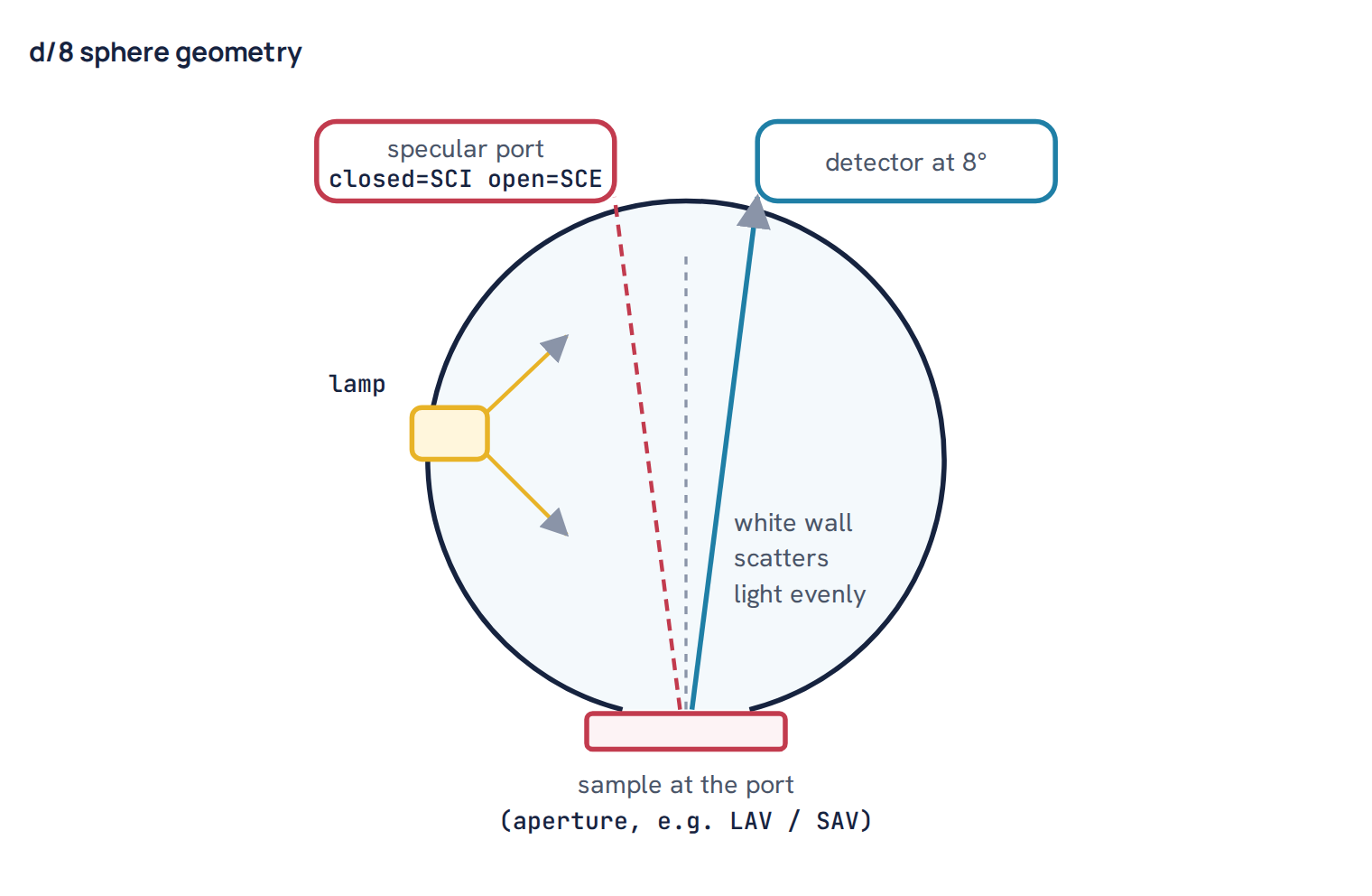
Most textile labs use a bench spectrophotometer with d/8 geometry. The “d” means diffuse illumination: the lamp lights the inside of a white-coated integrating sphere, and the sphere bathes the sample in light from all directions. The “8” means the reflected light is collected at 8° from the perpendicular to the sample. Diffuse lighting suits textiles well, because the surface texture of a knit or a towel has less effect than it would under a single directional beam.
SCI and SCE
Opposite the viewing angle, at the mirror angle, many instruments have a small port that can be opened or closed. With the port closed, the gloss (specular reflection) is included in the reading. This is SCI, specular component included. With it open, the gloss escapes and is left out. This is SCE, specular component excluded. SCI describes the colour of the material independent of its surface shine, so it is the usual setting for recipe formulation and most textile quality control. SCE is closer to what the eye sees on a glossy surface. The rule that matters most is simple: measure the standard and the batch in the same mode, and agree the mode with the buyer.
Aperture size
The aperture is the window in the port that the sample covers. A large area view, often around 25 to 30 mm depending on the instrument, averages out the texture of knits, melanges and slubs. A small area view, often about 10 mm or less, is used for narrow tapes, small trims or yarn wraps. Use the largest aperture the sample can fully cover, and always use the same aperture for standard and batch. A reading taken with part of the window uncovered is worthless.
Preparing a knit sample
- Fold to opacity. A single layer of single jersey lets light through, so the backing shows in the reading. Fold the fabric into enough layers that adding one more layer no longer changes the reading. For most knits this is two to four layers; very light fabrics may need more. Use the same number of layers every time.
- Average several readings. Take several readings at different positions, rotating the sample about 90° between them, and let the software average them. Knits are directional, and a single reading can be off by a surprising amount.
- Measure the face side, flat, without creases, stretch or press marks under the aperture.
- Condition the sample. Fabric moisture changes the reading. Let samples sit in a standard atmosphere, commonly 20 °C and 65% relative humidity, for some hours before a critical reading. The exact time varies by lab method and fabric.
- Never measure warm or damp fabric. Wet fabric reads darker, and many dyes change shade slightly with temperature (thermochromism). A sample straight from the dryer or the iron will not give the same reading 30 minutes later.
Calibrate the instrument at the start of every shift, or as often as its maker recommends, using the black trap and the white tile. Keep the tile clean and in its case.
Light sources: D65, TL84, CWF, A and UV
Software calculates colour for a named illuminant, which is a standard table of energy at each wavelength. The physical lamps in a light box are made to imitate these tables. The ones you meet most often in a dye house are:
- D65: average daylight with a colour temperature of about 6500 K. The usual primary illuminant for matching.
- TL84: a tri-band fluorescent lamp of about 4000 K, widely used in European and many other retail stores. The illuminant F11 is a close standard equivalent.
- CWF: cool white fluorescent, about 4100 K, common in American store and office lighting. F2 is its standard equivalent.
- A: incandescent tungsten light, about 2856 K, very warm and yellowish. It represents home lighting.
- UV: an ultraviolet lamp, used in the light box to show optical brightening agents, which glow blue under it.
Each buyer names a primary illuminant, often D65, and one or two secondary ones, such as TL84 and A, to check for metamerism. Some retailers use their own store lamp instead.
The software also needs an observer. The CIE has two standard observers: the 2° observer from 1931 and the 10° observer from 1964. The 10° observer represents viewing a larger area, which is closer to how we look at a fabric swatch. In textiles, D65 with the 10° observer, often written D65/10, is the normal combination.
CIELab and L*C*h: the numbers that describe a shade
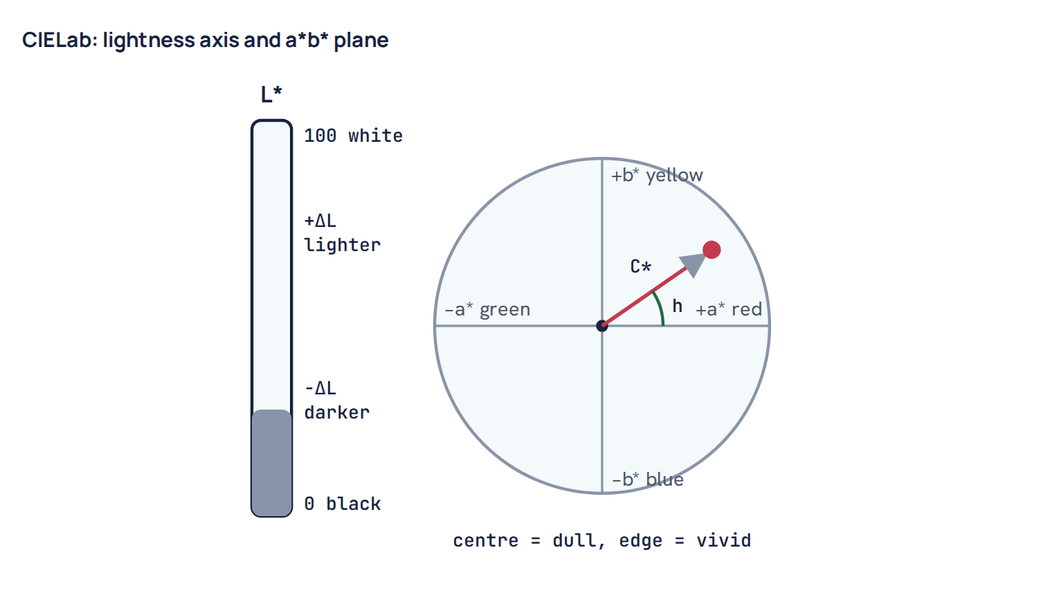
The reflectance curve is turned into three numbers that place the colour in a three-dimensional space called CIELab. It was designed so that equal distances in the space look roughly like equal colour differences to the eye.
- L* is lightness, from 0 (black) to 100 (white).
- a* runs from green (negative) to red (positive).
- b* runs from blue (negative) to yellow (positive).
The same point can be described in polar form, called L*C*h. L* is unchanged. C*, chroma, is the distance from the grey centre line, so it measures how saturated or bright the colour is. A high C* is a vivid colour; a low C* is dull or greyish. h, hue angle, is the direction from the centre in degrees: about 0° is red, 90° yellow, 180° green and 270° blue.
Reading a difference
Measuring a batch against its standard gives differences, always written as batch minus standard:
- ΔL* positive: batch is lighter. Negative: darker.
- Δa* positive: batch is redder (or less green). Negative: greener (or less red).
- Δb* positive: batch is yellower (or less blue). Negative: bluer (or less yellow).
- ΔC* positive: batch is brighter, more saturated. Negative: duller.
- ΔH*: the hue difference. Its size tells how far the hue has moved; the software usually adds a word such as “redder” or “yellower” to show the direction.
For shade correction, ΔL, ΔC and ΔH are usually easier to act on than Δa and Δb, because they line up with how a colourist thinks: depth, brightness and cast. But Δa and Δb tell you directly which component of the recipe is short or strong.
Delta E: one number for the total difference
ΔE is the total colour difference, combining lightness, hue and chroma into one number. There are several formulas, and the number you get depends on which one you use. Always check which formula a report shows.
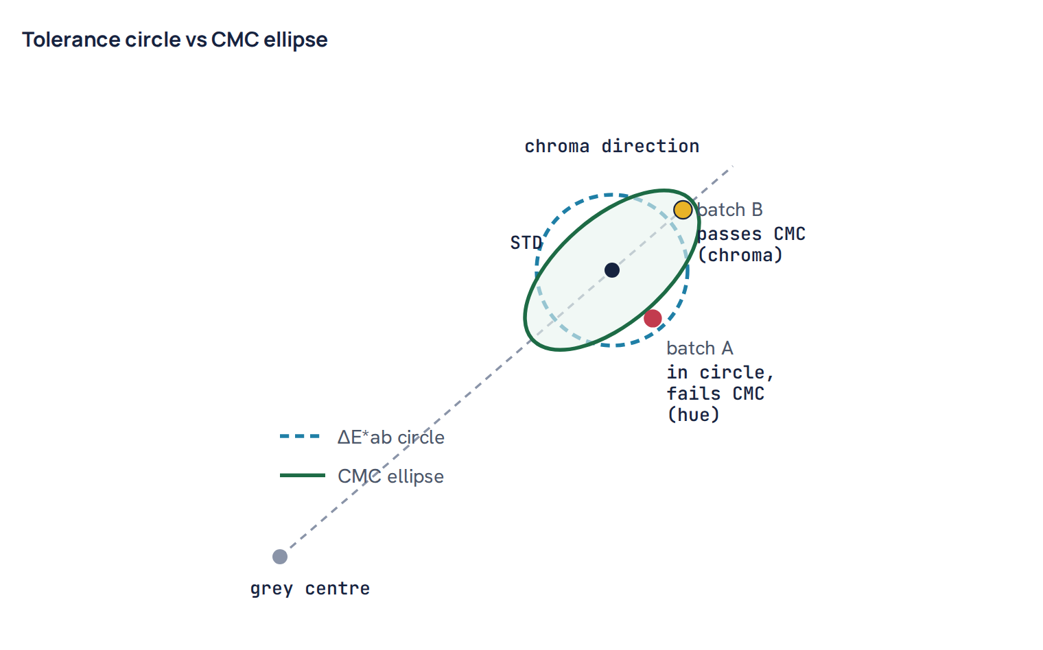
- ΔE*ab (CIELab, 1976) is the straight-line distance between the two points: the square root of ΔL² + Δa² + Δb². It is simple, but it treats all regions of colour space the same. The eye does not. We notice a hue shift in a dull grey far more easily than the same numerical shift in a vivid yellow. So a single ΔE*ab limit is too strict for some colours and too loose for others.
- ΔE CMC (l:c) fixes much of this by weighting lightness, chroma and hue differently depending on where the standard sits. For acceptability, textiles use CMC 2:1. The “2” means a lightness difference is given half the weight of chroma, because people tolerate a small depth difference more than a hue difference. It has been the main textile pass/fail formula for decades.
- CIEDE2000 is a newer formula that refines the same idea further, especially for blues and near-neutrals. In plain terms, it is a better-fitted version of the same kind of weighting. Some buyers now specify it, often with parametric factors set for textiles.
The weighting turns the pass zone from a sphere into an ellipsoid. In the a*b* plane this looks like an ellipse instead of a circle. The ellipse is long in the chroma direction and narrow in the hue direction, and it grows larger for more saturated colours. This matches the eye: a small hue shift is noticed sooner than a small change in brightness.
Typical tolerances
Pass limits are set by the buyer, and they vary. A common requirement for solid shades is around 1.0 ΔE CMC 2:1 against the approved standard under the primary illuminant. Some buyers ask for tighter limits, some allow more for difficult shades or for lot-to-lot variation, and many add a separate limit under the secondary illuminants. Read each buyer’s colour manual instead of assuming one number.
Remember that the tolerance applies to the batch against the master standard, not against the last lot. If each lot is allowed to drift slightly from the previous one, you can end up far from the standard within a few lots while every single comparison looked fine.
Metamerism: a match in one light, a mismatch in another
Two samples are a metameric pair when they match under one illuminant but not under another. This happens because their reflectance curves are different but, under the first light, the differences happen to cancel out when the eye adds them up. Change the light, and the balance is lost.
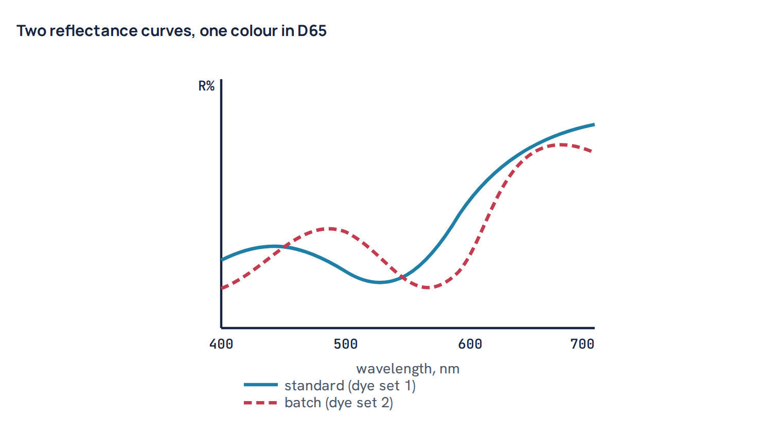
A typical case: the buyer’s standard was dyed with one set of dyes, and the lab matched it in D65 with a different set. In D65 the ΔE CMC is 0.5. Under TL84 it jumps to 1.8 and the batch looks visibly redder. TL84 has strong narrow peaks of energy in a few regions of the spectrum. If the two curves differ in exactly those regions, the difference is magnified under that lamp.
The software shows metamerism by reporting ΔE under each illuminant. Some systems also give a metamerism index: the colour difference under the test illuminant after the pair has been corrected to match exactly under the reference illuminant. A low index means the match will hold across lights. A related term, colour inconstancy, describes how much one sample alone shifts in colour between lights.
How to minimise metamerism
- Use the same dye set as the standard whenever you can. If the standard was dyed with known dyes, match with the same ones. Same dyes give the same curve shape, and the curves stay parallel.
- Ask what the standard was dyed with. When the standard is a paper card or a fabric dyed elsewhere, the curve tells you a lot. Choose dyes whose curves look like the target curve.
- Avoid odd combinations. Building a grey or a brown from a bright red, a bright green and a blue may match in one light, but it will swing. Keep to well-matched trichromatic sets and the fewest dyes possible.
- Check every match under the buyer’s secondary lights before submitting a lab dip, not only in D65.
Light fastness is another reason to choose the dye set carefully, since a mixed set can fade unevenly and change hue; see how to test colour fastness to light.
Visual assessment in the light box
The instrument does not replace the eye. Final approval is still often visual, and every instrument result should be confirmed in a standardised light box.
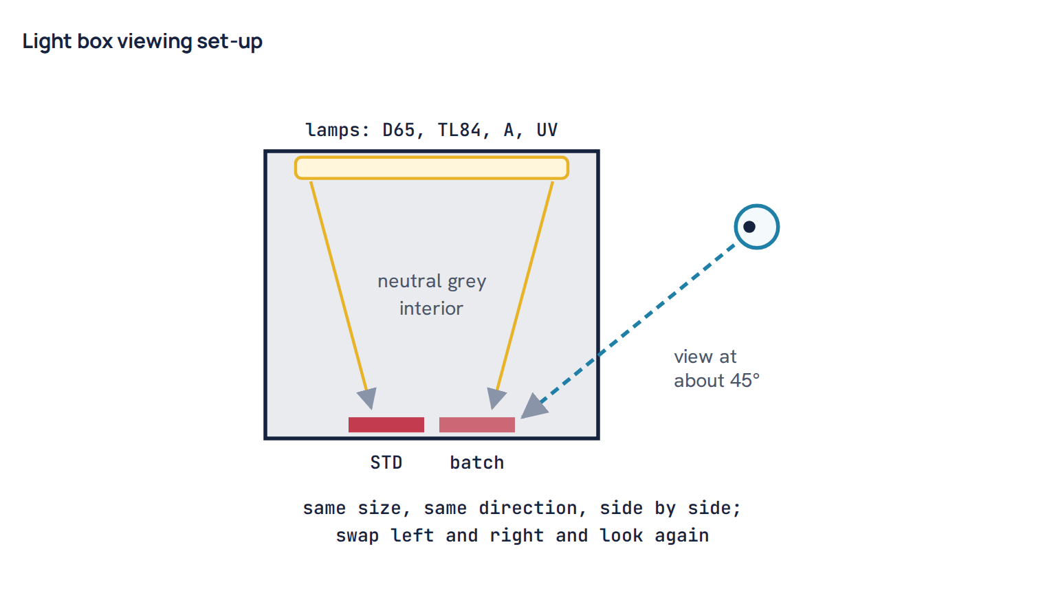
- Grey surround. The inside of the box is painted a neutral matt grey, usually in the mid-grey range. A coloured background shifts what you see.
- Geometry. Light falls roughly perpendicular onto the samples, and you look at about 45°, or the reverse. This keeps glare out.
- Sample presentation. Standard and batch of the same size, same number of layers, same face up, with wales or pile in the same direction, touching each other edge to edge. Then swap left and right and look again. The eye has a bias toward one side.
- One light at a time. Check the primary light first, then each secondary light. Switch lamps and let your eyes adjust for a few seconds.
- Clean lamps on schedule. Lamps age and drift in colour. Log their hours and replace them as the maker recommends.
- Check the observers. Everyone who approves shades should pass a colour vision test, such as a pseudo-isochromatic plate test for screening and a hue-arrangement test for finer ability. Assessors should avoid wearing bright colours near the box and should rest their eyes after long sessions.
When instrument and eye disagree
Sometimes the report says pass and the eye says fail, or the opposite. Common reasons are: the sample was folded or measured differently from the standard; the standard is a different material, such as paper or a woven when the batch is a knit; the fabric has strong surface effects like sheen, brushing or melange that the instrument averages but the eye does not; the colour sits in a region where the formula fits the eye less well, such as dark navies, near-greys and very bright colours; or the light box lamps have drifted. Investigate before overruling either one. In most buyer programmes the written colour standard says which one has the final word, often visual for approval and instrumental for routine bulk control.
Strength, shade sorting and batch continuity
Besides ΔE, the software reports colour strength as a percentage of the standard. It compares the amount of colour in the batch with the standard, usually using K/S values at the wavelength of maximum absorption or summed across the spectrum. 100% means the same depth. 95% means the batch is about 5% weaker, so roughly 5% more dye would bring it to depth if the hue is right. Strength is useful when checking a new lot of dye powder against the old lot, or a supplier’s dye against the agreed standard: if the new lot is 96% strong, the recipe needs adjusting before it goes to the floor.
In bulk, several lots that each pass against the standard can still differ from each other. If a garment is cut from two lots that sit on opposite sides of the tolerance, the panels will not match. Shade sorting groups lots into small boxes inside the tolerance, based on their ΔL, Δa and Δb (or ΔL, ΔC, ΔH). A common approach divides each axis into steps, and lots in the same box can be used together. The cutting room then lays panels of one garment from the same group. Good batch continuity means keeping lots close to the centre of the tolerance so they fall into as few groups as possible. Consistent fabric preparation, water, liquor ratio and process control matter more for this than corrections do; see the 100% cotton knit dyeing process for the steps that drive repeatability.
Kubelka-Munk K/S: how recipe prediction works
Reflectance is not proportional to dye concentration. Doubling the dye does not halve the reflectance. To predict recipes, software converts reflectance into a value that behaves more simply. The Kubelka-Munk theory does this with one short formula:
K/S = (1 − R)² ÷ 2R, where R is reflectance as a fraction (for example 0.20 for 20%), K is light absorption and S is light scattering.
For a dyed textile, the fibre does most of the scattering and the dyes do the absorbing. Over a useful working range, K/S rises roughly in proportion to dye concentration, and the K/S values of the dyes in a mixture add together at each wavelength. That makes calculation possible. The lab dyes each dye at several depths on the actual substrate to build a calibration. The software then searches for the mix of dyes whose summed K/S curve gives the closest match to the target, under the main illuminant and with the least metamerism under the others.
The prediction is a starting point, not the answer. Real dyeing departs from the simple model at very high depths, where the fibre saturates, and with dyes that interact. The first lab dip usually needs one or two corrections. If you want the arithmetic of turning a percentage recipe into weights, see dyeing recipe calculation, and for why depth does not keep rising in a straight line, see how dyeing works.
Common mistakes
Common mistake: Measuring the batch with two layers and the standard with four, or with a different aperture or SCI/SCE setting. The difference you see is partly the method, not the dyeing. Fix one method for each quality and write it down.
Common mistake: Reading a sample hot from the dryer or still damp from the stenter. It reads darker and sometimes duller, and the shade “moves” after a while. Cool and condition first.
Common mistake: Matching only in D65 and submitting. The lab dip fails under the buyer’s store light. Check all the buyer’s illuminants before you send anything.
Common mistake: Comparing ΔE values from different formulas. A ΔE*ab of 1.5 and a ΔE CMC of 1.5 are not the same difference. Always note the formula and illuminant.
Common mistake: Correcting the batch against the previous lot rather than the master standard, so the shade drifts across a season.
Common mistake: Adding the “missing” dye blindly from the Δa or Δb figure without considering lightness. Every dye addition also darkens the shade. If the batch is already dark, adding one component may push ΔL out of tolerance.
Worked example: reading a report and deciding the correction
Worked example. A coral shade on cotton single jersey, dyed with reactive yellow, red and a small amount of blue. Standard (D65/10): L* 58.0, a* 32.0, b* 14.0, so C* is 34.9 and the hue angle is about 23.6°. The batch reads L* 59.4, a* 30.8, b* 14.6. The report shows ΔL +1.40, Δa −1.20, Δb +0.60, ΔC −0.84, ΔH +1.04 (yellower). ΔE*ab is 1.94 and ΔE CMC 2:1 is 1.11. The buyer’s limit is 1.0 CMC, so the batch fails.
Now read each number as a colourist:
- ΔL +1.40: the batch is lighter, so it is short of depth overall.
- Δa −1.20: it is less red. This is the largest colour component, pointing at the red dye.
- Δb +0.60: slightly yellower. Combined with less red, the hue has turned toward yellow, which is why the hue angle rose from 23.6° to about 25.4°.
- ΔC −0.84: slightly duller. A weaker red in a red-dominant shade lowers chroma.
- ΔH +1.04: a noticeable hue shift toward yellow. In CMC this weighs more than the lightness difference, because CMC 2:1 halves the weight given to ΔL.
The pattern points to one cause: the red component is short. The yellow is not really too high; it only looks high because there is less red around it. So the correction is a small addition of red alone, which will darken the shade (reducing the +ΔL), raise a* back toward the standard, pull the hue back toward red and lift chroma. Do not add yellow, and do not add blue, which would dull the shade further. The size of the addition comes from the recipe prediction software or from the dye house’s own correction records; as a rough guide, a lightness gap of this size often needs only a few percent of the red already in the recipe. After the addition, re-measure, check D65, TL84 and A, and confirm in the light box.
If the same batch had read darker and redder, the answer would not be to add yellow and blue to “balance” it. Every addition makes it darker still. Depending on the size of the gap, the options are to accept within tolerance, to reduce the shade with a careful soaping or partial strip, or to re-dye. That is why it pays to aim slightly on the light side of the target in the first dyeing and finish with a small addition.
Colour measurement does not dye the fabric for you. What it gives is a common language. The lab, the floor and the buyer can describe a difference in the same terms, see which direction it lies in, and agree whether it matters. Used with good sample preparation and a trained eye in the light box, it turns shade matching from an argument into a routine check.
Questions
What does ΔL, Δa and Δb mean on a colour report?
They are batch minus standard. Positive ΔL is lighter, positive Δa is redder and positive Δb is yellower; negative values mean darker, greener and bluer.
What is a good Delta E for textile shade approval?
It depends on the buyer. Around 1.0 ΔE CMC 2:1 under the primary illuminant is a common limit, but some buyers set tighter or looser limits and add separate limits for other lights.
Why does my shade match in D65 but not in TL84?
The batch and standard have different reflectance curves that happen to give the same colour in daylight. This is metamerism, usually caused by using a different dye combination from the standard.
How many layers should I fold a knit for measurement?
Fold until adding one more layer no longer changes the reading, often two to four layers for most knits. Use the same number of layers for standard and batch.
What is the difference between SCI and SCE?
SCI includes the gloss in the reading and describes the material’s colour regardless of shine; SCE excludes the gloss and is closer to what the eye sees. Measure standard and batch in the same mode.

Textile engineer with 14+ years in dyeing and fabric development. He writes every guide on Dyeing Solution from real production work. Full profile